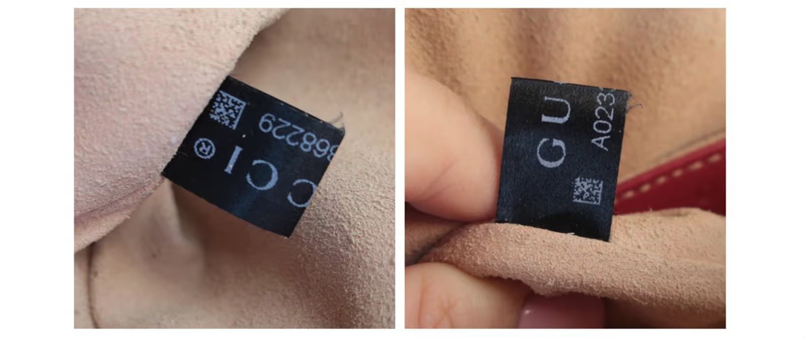
A Gucci black label can supply useful evidence about the bag around it. Its value comes from the relationship between the fabric, lettering, printed symbol and edges. A recognizable GUCCI wordmark or a tiny square code carries much less information when viewed alone.
The part I find most useful is how those features interact. Does a break in a letter follow the fabric underneath? Is a loose thread coming from a cut edge, or is the label’s attachment damaged? Is the square pattern actually an ordinary QR code? Each question changes what you can reasonably conclude.
This guide focuses on the narrow black fabric label bearing a wordmark, characters and a small two-dimensional symbol. A black clothing brand label is a different comparison task. Begin with the bag’s exact model and version; my Gucci bag models guide helps establish that context.
Table of Contents
What the Black Label Can Tell You
A useful black-label check compares five dimensions: fabric, color, letter shapes, print behavior and edge construction. Read them together, then check whether the label fits the exact bag. The strongest evidence is a coherent construction pattern.
First, Separate the Fabric Label, Leather Stamp and NFC Tag
These details are often grouped under “Gucci authenticity tag,” even though they require different reading methods. Confusing them creates a particularly unhelpful test: pointing a camera at printed fabric and treating the absence of an app response as a counterfeit result.On smaller screens, swipe horizontally to see all columns.
| Detail | How it is read | Useful role | Main limitation |
|---|---|---|---|
| Black fabric label | Visual inspection of fabric, printed characters and optical symbol | Compare label construction with a relevant example | The printed pattern does not establish an electronic chip or a public verification service |
| Leather tag or stamp | Read the physical impression and product-related characters | Compare the leather stamp with the item and period | Its typography and layout should not be transferred directly to printed fabric |
| Gucci Authenticity Tag using NFC | A compatible phone interacts electronically through the Gucci App | Access Gucci’s selected-product identity and care experience | Gucci limits availability to selected products |
Gucci’s official instructions describe NFC interaction and use of the Gucci App. They do not describe camera-scanning every black fabric label. I keep that distinction narrow here; the Gucci serial numbers and leather tags guide covers leather stamps and the broader NFC distinction.
Fabric: Observe the Weave Before Calling It Silk
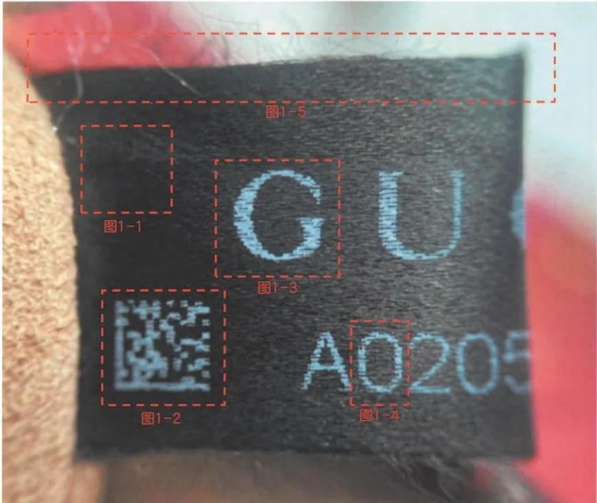
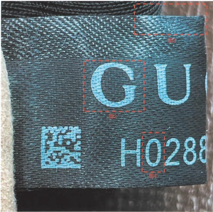
Reference A has a fine, lustrous fabric surface. In the small fabric detail below, the threads create closely spaced horizontal highlights and darker intervals. Those are observable features. They are a more useful starting point than a material name assigned from shine alone.
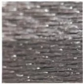
“Silk-like” describes appearance or feel; “silk” identifies a fiber. The Canadian Conservation Institute’s fiber-identification guidance uses microscopic characteristics and notes difficulties with dark or finished fibers. Here, silk-like is the appropriate visual description.
I compare apparent thread spacing, surface regularity and the way the lettering sits across the fabric. A coarse-looking label becomes a useful concern when the difference persists in comparable views and accompanies other construction differences. One bright reflection or a dark, flattened image earns little weight.
Use a label from a comparable bag, generation and condition as your fabric reference—not an unrelated silk scarf.
Color: Read the Whole Image, Not One Blue or White Pixel
The overview shows pale blue-gray lettering, while some detail crops appear almost white. That difference within this reference set is enough to make a strict screen-color rule unreliable. The printed region’s appearance needs to be considered alongside exposure, reflections and the surrounding fabric.
Two-tone areas deserve the same care. Reference A includes a marked darker region in the cloth. The comparison sample later in this guide also has conspicuous tonal variation. A darker patch therefore cannot function as a stand-alone authenticity marker.
My question is whether the tonal change relates coherently to the textile surface and fold, or appears as a separate, abrupt band with other unexplained construction differences. A photograph may not resolve that. When it does not, I leave color undecided instead of allowing it to drive the verdict.
Letter Shapes and Print: Compare the Pattern Across the Threads
In Reference A, interruptions in the G and numeral create a stepped, striped appearance. The useful comparison is how those interruptions relate to the fabric and recur across printed areas. Merely seeing a jagged edge is not enough: low-resolution images can make almost any curve look stepped.
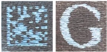
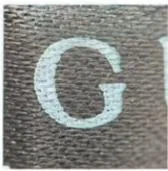
I read the wordmark at two levels. First, I look at the complete letter geometry: body, opening, terminal, proportion and spacing. Then I examine the distribution of the pale marking over the threads. A label can reproduce a recognizable letter outline while showing a different relationship between the marking and the underlying fabric.
Ask whether several printed areas behave consistently. If the same kind of interruption appears through a broad G stroke and a numeral, it provides a more useful internal comparison than one uncertain terminal. If the effect appears only at the outer boundary of a magnified character, there may be too little detail to distinguish fabric interaction from image artifacts.
The visible distinction is the marking’s behavior across the textile; identifying a specific ink or printing machine requires separate evidence.
The zero is a fabric-label comparison, not a universal Gucci font rule
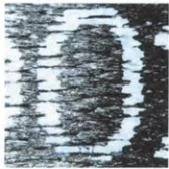 | 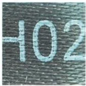 |
| Reference A: relatively straight side sections and interrupted strokes. | Comparison B: a rounder zero within the visible sequence. |
The zero in Reference A has relatively straight side sections before turning through its top and bottom. Comparison B looks more oval. That is a useful difference between these examples, particularly alongside their different print behavior.
Keep this comparison specific to fabric labels: leather impressions, metal engraving and clothing care labels use different marking systems. Check orientation too—a folded or tilted numeral can look narrower, wider or more curved. Compare the same character on a suitably matched label.
The Small “QR Code” May Have Data Matrix-Type Structure
The symbol beside the characters is often casually called a QR code. In the reference images, however, it has a border arrangement resembling Data Matrix: adjacent continuous borders with alternating elements along the other edges. It lacks the three prominent corner squares associated with a conventional QR symbol.
GS1 US explains the Data Matrix border arrangement, while DENSO WAVE describes the three corner detection patterns of ordinary QR Code. This is a morphology comparison. It does not establish that Gucci used GS1-formatted data, reveal the encoded content or confirm that these photographed symbols can be decoded.
This distinction changes the familiar “open right side” test. In a Data Matrix-type symbol, an alternating border can look like a broken line; rotating the label also changes which edge appears on the right. A dashed-looking edge may be part of the symbol’s structure. It is not, on its own, a Gucci-specific authenticity feature.
A buyer discussing a Gucci Attache asked about a rectangular code and unfamiliar date characters. I would start by establishing the symbol family and exact product version, then interpret the shape and sequence in that context.
Why a Black-Label Code May Not Scan
Separate three outcomes that are often collapsed into “it does not work.”
- The reader does not recognize a symbol. The image may lack detail, the label may be damaged, or the reader may not support that symbol type. Nothing has yet been learned about the encoded content.
- The symbol is decoded, but no useful page opens. Readable data need not be a public web address. That result does not establish encryption or a counterfeit item.
- An official NFC interaction fails. This is a separate electronic-reading question involving product eligibility, a compatible device and Gucci’s instructions.
In an r/gucci authentication discussion, a buyer reported that their phone could not read a small printed code. Record that as an unresolved reading result: “my camera did nothing” is different from “the bag failed authentication.”
The opposite outcome needs restraint too. A successful scan establishes that software read something. GS1’s digital-signature guidance discusses why ordinary barcode data can be copied and why stronger verification must connect trustworthy data with the physical item. This is a general security principle, not a description of Gucci’s undisclosed systems. Opening a plausible page cannot settle the origin of the bag holding the label.
Edges: Construction and Wear Answer Different Questions
Reference A has loose filaments; Comparison B shows a tidier, more contained edge. Read that difference through edge construction and condition.
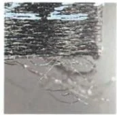 | 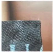 |
| Reference A: loose filaments are visible at the edge. | Comparison B: a more contained edge in this view. |
Before comparing two edges, establish what each one is: an exposed cut end, a longitudinal side, a fold, or the point where the label is attached. Those regions need not behave alike. Comparing a folded side with a cut end can manufacture a difference that says little about authenticity.
A fresh label may have few loose threads; handling or deliberate damage can create fraying. I give more weight to a construction mismatch that remains after edge orientation and condition are considered.
Preserve the label: pulling threads or rubbing print destroys useful detail. Treat existing attachment damage as a condition issue while assessing the remaining construction.
Reading the Two Examples Together
The reference pair identifies A as the genuine comparison and B as the counterfeit comparison. The purpose of showing B is to make the differences visible, not to turn one pair into a specification for every Gucci bag.
On smaller screens, swipe horizontally to see all columns.
| Dimension | Reference A | Comparison B | What makes it useful |
|---|---|---|---|
| Fabric surface | Fine-looking, closely spaced structure | More conspicuous texture and upper band | Compare equivalent areas with enough detail |
| Color | Pale blue-gray to near-white in different views | Also pale blue against a dark ground | Color similarity alone separates neither example |
| G and printed strokes | Visible striped interruptions | More continuous pale marking in the detail | Compare the marking’s relationship to the textile |
| Zero | Relatively straight side sections | More oval-looking sides | Combine geometry with other print observations |
| Edges | Loose filaments in the edge crop | A more contained edge in the crop | Match edge type and condition before weighting |
The small crops show the feature relationships at their original resolution; the larger overviews supply context. Enlarging a crop adds no weave or ink detail.
Use Three Observation States, Then Check Independent Evidence
For each feature, write consistent, conflicting or not assessable, and add a reason. “Not assessable” is an actual result: the edge may be hidden, the zero incomplete, or the fabric too blurred to compare. It should not silently become a pass or fail.
Then group related observations. A G, zero and symbol with similar interruptions may all reflect one marking process. They strengthen your description of that process but do not equal three independent authentication tests. Color and surface sheen can similarly share one imaging explanation.
I look for agreement across different kinds of evidence: the label’s construction, its attachment to the bag, the exact model configuration and other item details. A consistent label supports that wider picture. A well-resolved label conflict deserves investigation even when a seller supplies a familiar-looking code.On smaller screens, swipe horizontally to see all columns.
| Observation | Weight I give it | Reasonable next step |
|---|---|---|
| One pale letter or apparently white print | Low without comparable color conditions | Check whether the entire image is affected |
| Repeated differences in marking and fabric construction | More useful with a matched reference | Compare the label’s attachment and independent bag details |
| An unreadable symbol or hidden edge | Not assessable | Resolve the missing observation before interpreting it |
| No loose thread | Low in isolation | Identify the edge type and account for condition |
| A visible label that resembles A | Supporting | Continue the full item review |
| A claimed date inconsistent with documented product history | A conflict to verify | Recheck the transcription, decoder source and actual version |
Missing Black Labels and Changing Label Layouts
“I cannot see a black label” and “this item was made without one” are different statements. A narrow label can be hidden in a seam or fold; a damaged label can leave only an attachment remnant; a product may belong to a category or generation with another labeling arrangement.
Vintage pieces and very small leather goods need comparison with their own product generation, not an assumed current-handbag standard. I have not established one introduction year or a universal size cutoff for this label. Find a comparable item before interpreting its absence; “mini” alone is not an exemption.
A buyer discussion about newer GG Marmont labels asks whether a black label can appear without the familiar leather code tab. Check that exact version’s layout; a buyer’s report alone is insufficient to establish a brand-wide change.
For a missing-label assessment, establish the model and likely period, locate the expected attachment area using a comparable example, and distinguish an unobserved label from an absent or damaged one. If the version cannot be established, keep the absence unresolved.
Can the Black-Label Characters Tell You the Year?
Online date-code tables offer leads. I have not found a Gucci-issued decoder covering every black-label prefix, so I check a chart’s source before assigning a year.
Use a dating claim in three stages. Preserve the visible sequence, including uncertain characters. Identify what supports the proposed year: an official record, a documented comparison or an unverified online table. Then compare the proposed period with the exact product’s history and available documents.
A purchase date, production date and collection introduction are different events. A receipt linked to the actual item records a transaction; it does not necessarily specify when that item was manufactured. Likewise, an apparently plausible year cannot authenticate the fabric label or surrounding bag.
I prefer a supportable period, leaving the date open when the records are insufficient.
Four Situations That Change My Buying Decision
These are illustrative situations, not reports of purchases or authentication outcomes.
A newer bag has a tidy edge and the phone camera does nothing
I would keep the purchase under consideration, identify the reader’s actual result and compare the label generation. The next useful evidence is the label’s construction and attachment.
A worn bag has blue lettering, two-tone fabric and loose threads
I would move past those familiar surface cues and compare marking behavior, numeral geometry and attachment—the details that better distinguish the two examples shown here.
A label has different lettering, a coarser surface and an unexplained attachment
If the reference is truly comparable and the differences are clearly visible, I would pause the purchase. The concern extends beyond one letter into separate construction observations. I would request a complete item assessment rather than try to cancel the conflicts with a matching online code.
A mini bag has no visible black label and the seller supplies a year chart
I would establish the expected layout for that version and inspect its attachment area, then assess the year chart’s source. If those details remain unresolved, I would hold the purchase.
Frequently Asked Questions
Does every Gucci bag have a black fabric label?
Label arrangements vary by period and category. Check the exact version, especially for vintage pieces and very small leather goods.
Is the black Gucci label made of silk?
Silk-like describes the reference fabric’s fine, lustrous appearance. Confirming silk requires a material specification or fiber analysis.
Is the symbol on the black label a QR code?
The examples resemble Data Matrix-type symbols, recognizable by continuous and alternating borders. Conventional QR symbols have three prominent corner squares.
Why will my Gucci black-label code not scan?
Reader support, image detail or damage may explain a failed read. Distinguish optical scanning from Gucci’s separate NFC interaction.
Must a genuine Gucci black label have frayed edges?
No. Assess edge construction alongside wear; fresh, handled and damaged labels can look different.
Can the black-label code prove the bag’s production year?
A code needs a reliable decoding source and a match with the exact product history. Treat unverified year charts as leads.
Can a convincing black label prove authenticity?
No. It supports a complete item assessment when its construction and attachment agree with the bag’s other details.
My Final Check Before Relying on the Label
I want a clear explanation of what matches, what conflicts and what remains unreadable. The strongest conclusion comes from a label that makes sense as a physical component of the exact bag, supported by independent details. For a pre-owned purchase, use the complete designer bag authentication guide to place these findings within the wider decision. A tiny printed code should help you ask better questions, not end the investigation.